The Art of Graphing Compound Interest: A Complete Guide

Compound interest is a financial concept that, while often underestimated, has the potential to drastically shape long-term financial outcomes. For those who invest wisely or are trying to manage savings, the power of compound interest can turn modest sums into substantial growth. However, the true impact of this financial principle becomes even clearer when we shift from mere numbers to a visual representation. By graphing compound interest, individuals can not only understand the mathematics behind the concept but also observe how exponential growth takes place over time.
The purpose of this article is to take a deep dive into the intricacies of graphing compound interest. From understanding the basic components that factor into compound interest to seeing how a graph can visually explain compounding growth, we’ll cover all aspects in a clear and straightforward way. If you’ve ever been curious about how small investments can grow so significantly, graphing compound interest will give you both insight and clarity. Transfer Pension to IRA: Unlock 5 Powerful Benefits.
Understanding Compound Interest
Before delving into graphing compound interest, it’s crucial to understand what compound interest itself entails. In simple terms, compound interest refers to earning interest on both the initial principal (the amount of money you initially invest) and the accumulated interest from previous periods. Unlike simple interest, where interest is only calculated on the principal, compound interest adds a new layer of growth as interest itself becomes part of the equation.
The formula to calculate compound interest is:
A = P(1 + r/n)^(nt)
Where:
- A is the final amount (including principal and interest)
- P is the principal amount
- r is the annual interest rate (in decimal form)
- n is the number of times interest is compounded per year
- t is the time in years
While the formula itself provides a solid understanding of how compound interest works, seeing its impact over time through graphing compound interest offers a much clearer representation of exponential growth.
Why Graph Compound Interest?
Numbers alone can often be abstract, especially when dealing with large sums or long periods. Graphing compound interest allows individuals to visually comprehend the long-term effects of consistent investment and reinvestment. This is particularly useful for those who are planning for retirement or large future expenses.
When graphing compound interest, the curve starts slowly but eventually skyrockets as the interest compounds on itself over time. This visual representation helps to emphasize two critical points:
- Time: The longer the investment remains untouched, the greater the exponential growth.
- Rate of Interest: Even slight changes in the interest rate can have significant effects on the overall outcome when graphed over time.
Components of Compound Interest Growth
To fully grasp graphing compound interest, it’s essential to break down the various factors that influence the curve’s shape. Let’s explore these elements one by one:
Principal Amount
The principal amount is the foundation of any compound interest graph. It serves as the starting point for the graph and defines the initial value on the y-axis. A higher principal amount will naturally result in greater accumulated interest over time, leading to a steeper curve on the graph.
Interest Rate
The interest rate is one of the most crucial factors in graphing compound interest. Even a small difference in interest rates can have a profound impact when compounded over many years. A graph showing the effect of a 2% interest rate versus a 5% interest rate will highlight vastly different curves, with the 5% rate showing a more pronounced upward trajectory.
Frequency of Compounding
Interest can be compounded at various intervals, including annually, semi-annually, quarterly, or even daily. The frequency of compounding has a direct impact on how quickly the interest grows. A graph showing monthly compounding versus annual compounding will have a steeper curve due to more frequent reinvestment of interest.
Time Horizon
One of the most compelling aspects of graphing compound interest is the effect of time. The longer the money is left to grow, the steeper the curve becomes. The graph remains relatively flat in the early years but eventually shows exponential growth as time progresses.

The Exponential Nature of Compound Interest
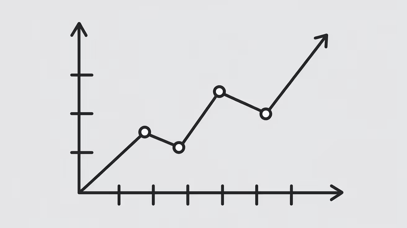
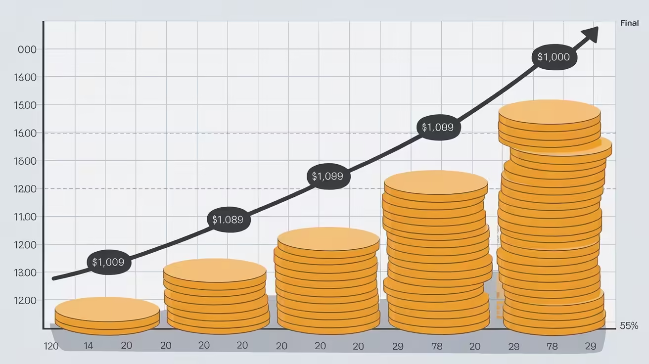
Compound interest is often referred to as a form of exponential growth. What does this mean in practical terms? When graphing compound interest, the graph takes the shape of a curve that rises slowly at first, then rapidly accelerates upward.
This exponential nature is why financial experts emphasize starting investments early, even if they are small. The earlier you begin, the more time you allow for the interest to compound upon itself. The upward curve of a graph of compound interest visually demonstrates how powerful small, consistent investments can become over time.
Let’s explore a real-life example of graphing compound interest:
Example:
Assume you invest $1,000 at an annual interest rate of 5%, compounded annually for 20 years. Using the formula, we can calculate the final amount:
A = 1000(1 + 0.05/1)^(1*20) = $2,653.30
The key takeaway here is that your initial $1,000 more than doubles over 20 years. Now, when this is graphically represented, the curve shows a slow rise in the early years, but the growth becomes noticeably steeper in the later years as compounding takes effect.
How to Graph Compound Interest: A Step-by-Step Guide
Creating a graph to visualize compound interest doesn’t have to be complex. With modern tools like Excel, Google Sheets, or financial graphing calculators, you can easily produce a detailed graph. Here’s a basic guide on how to create your own graph of compound interest.
Step 1: Choose Your Variables
- Principal: This is the initial investment. For this example, we’ll use $1,000.
- Interest Rate: Let’s select an annual interest rate of 5%.
- Compounding Frequency: For simplicity, we’ll use annual compounding.
- Time Frame: We’ll graph the growth over 20 years.
Step 2: Calculate Compound Interest Over Time
Using the compound interest formula, calculate the total amount for each year (or each compounding period, depending on your preference).
For example:
- Year 1: A = 1000(1 + 0.05/1)^(1*1) = $1,050
- Year 2: A = 1000(1 + 0.05/1)^(1*2) = $1,102.50
- Year 3: A = 1000(1 + 0.05/1)^(1*3) = $1,157.63
- Continue this process for all 20 years.
Step 3: Create a Table
Using your calculated values, create a table with two columns: “Year” and “Amount”. Each row will represent a specific year, and the corresponding amount will show how the investment grows due to compound interest.
Step 4: Plot the Data
Using a graphing tool (like Excel), plot the years on the x-axis and the total amount on the y-axis. This will give you the graph of compound interest.
Step 5: Analyze the Curve
Observe how the graph starts relatively flat, with modest growth in the early years. However, as the interest compounds, the curve steepens, reflecting the exponential nature of compound interest.
Tools for Graphing Compound Interest
Thankfully, graphing compound interest doesn’t require advanced mathematics or manual calculations. Today, there are numerous tools available to help you visualize your investment growth over time.
Excel or Google Sheets
Both Excel and Google Sheets offer built-in functionality to easily create a compound interest graph. You can input your principal, interest rate, compounding periods, and time frame, and these tools will generate the graph for you. It’s as simple as entering the formula into a cell and dragging the formula down to extend it over multiple years.
Online Compound Interest Calculators
There are numerous free online compound interest calculators that not only compute the future value of investments but also generate graphs based on the inputted values. Tools like these make graphing compound interest accessible to everyone, even those with limited financial experience.
Financial Software
More advanced financial software, like Microsoft Money or Quicken, offers powerful graphing capabilities. These programs not only allow you to create custom graphs but also offer insights into long-term financial planning, showing the effects of different interest rates, compounding frequencies, and investment strategies.
Real-Life Applications of Compound Interest
Retirement Planning
One of the most common uses for graphing compound interest is retirement planning. Most retirement accounts, like 401(k)s and IRAs, rely heavily on compound interest to grow the invested funds. Graphs can help individuals visualize the importance of starting early and contributing consistently.
Education Savings
Parents often use compound interest to save for their children’s education through 529 plans or other education-focused investment accounts. A graph of compound interest can help parents understand how small contributions over time can lead to a fully-funded education account.
Mortgage and Debt Reduction
While compound interest is often associated with investments, it can also apply to debt, especially mortgages. Graphing the interest paid on a loan versus the principal can reveal how quickly (or slowly) debts are being repaid and how much interest accumulates over time.
Common Misconceptions About Compound Interest
Despite the clear benefits of graphing compound interest, several misconceptions persist about how compound interest works. Let’s clear them up:
- Myth: Compound interest grows at the same rate throughout the entire investment period.
- Fact: Compound interest grows exponentially, not linearly. It starts slow but accelerates rapidly over time.
- Myth: A small difference in interest rates won’t make a big impact.
- Fact: Even a small difference in rates, when compounded, can have a dramatic effect over decades.

Exploring Different Types of Compound Interest Graphs
Graphing compound interest can take on different shapes and forms, depending on the parameters that are selected. To fully understand the nuances and potential applications, let’s examine how different scenarios influence the shape and direction of compound interest graphs. This exploration not only enriches our understanding of compounding, but also provides insights into how different strategies can impact long-term financial outcomes.
Annual Compounding vs. Monthly Compounding
One of the key distinctions that graphing compound interest highlights is the difference between annual and more frequent compounding intervals, such as monthly compounding.
Annual Compounding
When interest is compounded annually, the total interest is calculated and added to the principal at the end of each year. As a result, the interest compounds slower compared to more frequent compounding periods. The graph for annual compounding will still show exponential growth, but the curve will be relatively gradual in comparison to more frequent compounding schedules.
Monthly Compounding
On the other hand, with monthly compounding, the interest is added to the principal twelve times a year, rather than just once. This means that the interest compounds faster, leading to a steeper and more pronounced curve when graphing compound interest.
To illustrate, let’s take an example:
- Principal: $1,000
- Interest Rate: 5% annually
- Compounding Frequency: Annual vs. Monthly
- Time Period: 20 years
Using annual compounding, at the end of 20 years, the total value would be around $2,653. However, with monthly compounding, the final amount would be approximately $2,718. This difference may not seem significant, but over longer time frames or with larger amounts, the impact of more frequent compounding becomes even more dramatic when graphed.
Comparing Different Interest Rates
Another important factor to consider when graphing compound interest is how different interest rates affect the graph. Small variations in interest rates, especially over long periods, can lead to substantial differences in the final outcomes.
For instance, let’s compare the growth of two investments:
- A principal of $1,000 invested at an interest rate of 4% annually for 20 years.
- A principal of $1,000 invested at an interest rate of 6% annually for 20 years.
By graphing compound interest for both scenarios, the stark difference becomes immediately apparent. The first investment at 4% would grow to around $2,191, while the second investment at 6% would grow to approximately $3,207. Despite a seemingly small 2% difference in interest rates, the second investment ends up with over $1,000 more at the end of 20 years, a difference that is strikingly visible on the graph.
This demonstrates how even small increases in the interest rate can significantly amplify the growth of an investment, especially over longer time periods. Graphs make these differences tangible and help investors make better choices about where to put their money.
Time as a Multiplier of Compound Interest
Time plays a crucial role in graphing compound interest, and it is one of the main reasons why financial advisors stress the importance of starting to save or invest as early as possible. The longer your money is allowed to grow, the more powerful the effects of compounding become.
Consider this example:
- Investment A: $1,000 invested for 10 years at 5% compounded annually.
- Investment B: $1,000 invested for 30 years at the same 5% compounded annually.
Using the compound interest formula, we find that Investment A grows to $1,628 after 10 years. However, Investment B grows to $4,321 after 30 years.
When graphing compound interest for these two investments, the difference in their curves becomes quite pronounced. In the early years, both investments grow at a relatively similar rate. However, as time goes on, the curve for Investment B steepens significantly, far outpacing Investment A. This visual representation emphasizes the value of a long-term investment strategy.
In financial planning, this effect is often referred to as the “snowball effect.” Over time, the compounded interest starts to resemble a snowball rolling downhill, gathering more and more snow (or interest) as it gains momentum. Graphing compound interest provides an easy way to visualize this concept and its importance.
The Rule of 72 and Compound Interest Graphs
One useful tool for understanding how long it takes for an investment to double with compound interest is the Rule of 72. The Rule of 72 is a quick and simple formula used to estimate the number of years required to double an investment at a given annual rate of interest.
The formula is as follows:
72 ÷ Annual Interest Rate = Approximate Number of Years to Double Investment
For example, if you are earning an interest rate of 6% annually, the calculation would be:
72 ÷ 6 = 12 years
This means that, at a 6% interest rate, your investment would approximately double every 12 years.
When graphing compound interest, the Rule of 72 can be very helpful for quickly estimating how long it will take for the curve to reach certain milestones, such as doubling in value. It’s another way to appreciate the power of compounding without needing to perform complex calculations, and the rule itself is often visible in the steep upward trajectory of the graph as doubling points are reached.
Graphing Compound Interest for Different Financial Goals
Beyond simple investments, graphing compound interest has practical applications in helping individuals plan for different financial goals, such as retirement, education, or debt repayment. Each of these financial goals comes with its own set of variables, but compound interest plays a significant role in all of them.
Retirement Savings
For many people, saving for retirement is the single most important financial goal. Since retirement savings typically stretch over decades, compound interest can significantly increase the value of the investment.
For example, a 30-year-old individual who begins investing $5,000 annually at an interest rate of 7% will have much more saved by the time they reach 65 than someone who waits until age 40 to begin investing the same amount. Graphing compound interest in this context can help show the difference in retirement savings between starting early and delaying investments.
The graph for the individual who begins saving at age 30 would display a much steeper curve in the later years, highlighting the long-term benefit of starting early. Conversely, the individual who starts saving at 40 will have a flatter curve, even though the same amount of money is being invested annually.
Education Savings
Another key application of graphing compound interest is saving for education, particularly through tax-advantaged accounts like 529 plans. As with retirement, the sooner you start saving for a child’s education, the more compound interest can work in your favor.
Let’s assume a parent begins investing $200 per month into a 529 plan when their child is born. Over the next 18 years, that account earns an average of 6% interest compounded annually. By the time the child is ready for college, the parent would have saved significantly more than if they had waited until the child was 10 years old to begin saving.
When graphing compound interest for this scenario, the difference in the curve’s steepness between starting at birth versus starting later is evident. It visually drives home the importance of early savings for major financial milestones like college.

The Role of Compound Interest in Reducing Debt
While graphing compound interest is often discussed in the context of growing investments, it also plays a crucial role in understanding debt repayment strategies. When it comes to loans, mortgages, or credit cards, compound interest works against the borrower, increasing the total amount owed over time.
In the case of a mortgage, for example, interest compounds on the outstanding principal, which means that the borrower ends up paying interest on both the original loan amount and the accumulated interest. Graphing compound interest can help borrowers visualize how different repayment strategies (e.g., paying more than the minimum monthly payment) can impact the total interest paid over the life of the loan.
By creating a graph that compares the interest owed under different repayment scenarios, borrowers can make informed decisions about how aggressively to pay down debt and minimize the impact of compound interest.
FAQs
What is the difference between simple and compound interest?
Simple interest only accrues on the principal amount, while compound interest accrues on both the principal and previously earned interest.
How can I manually graph compound interest?
You can calculate the compound interest using the standard formula and plot the values for each time period on a graph, with time on the x-axis and accumulated amount on the y-axis.
Does compound interest work the same for debt?
Yes, compound interest applies to both investments and debts, but in the case of debt, it works against you, causing you to pay more over time.
Why does the graph of compound interest steepen over time?
The graph steepens because the interest starts accumulating on both the principal and the previously earned interest, leading to exponential growth.
Is it better to invest in accounts with more frequent compounding periods?
Generally, yes. More frequent compounding periods (e.g., monthly vs. annually) lead to greater total returns over time.
What is the best way to visualize long-term financial growth?
The best way to visualize long-term financial growth is by graphing compound interest over time using tools like Excel, financial calculators, or dedicated software.
Conclusion
In summary, graphing compound interest provides a clear, visual representation of how investments grow exponentially over time. By understanding the components that influence compound interest—principal, interest rate, compounding frequency, and time horizon—investors can make better decisions about where and how to invest their money.
From planning for retirement to paying off a mortgage, the ability to visualize compound interest through graphs empowers individuals to see the true power of compounding and make informed financial decisions. Whether you’re a seasoned investor or just beginning your financial journey, graphing compound interest can help you stay on track toward achieving your long-term goals.
For more information regarding Finance Basic you can visit FinancewithAi Channel & Home